about the project
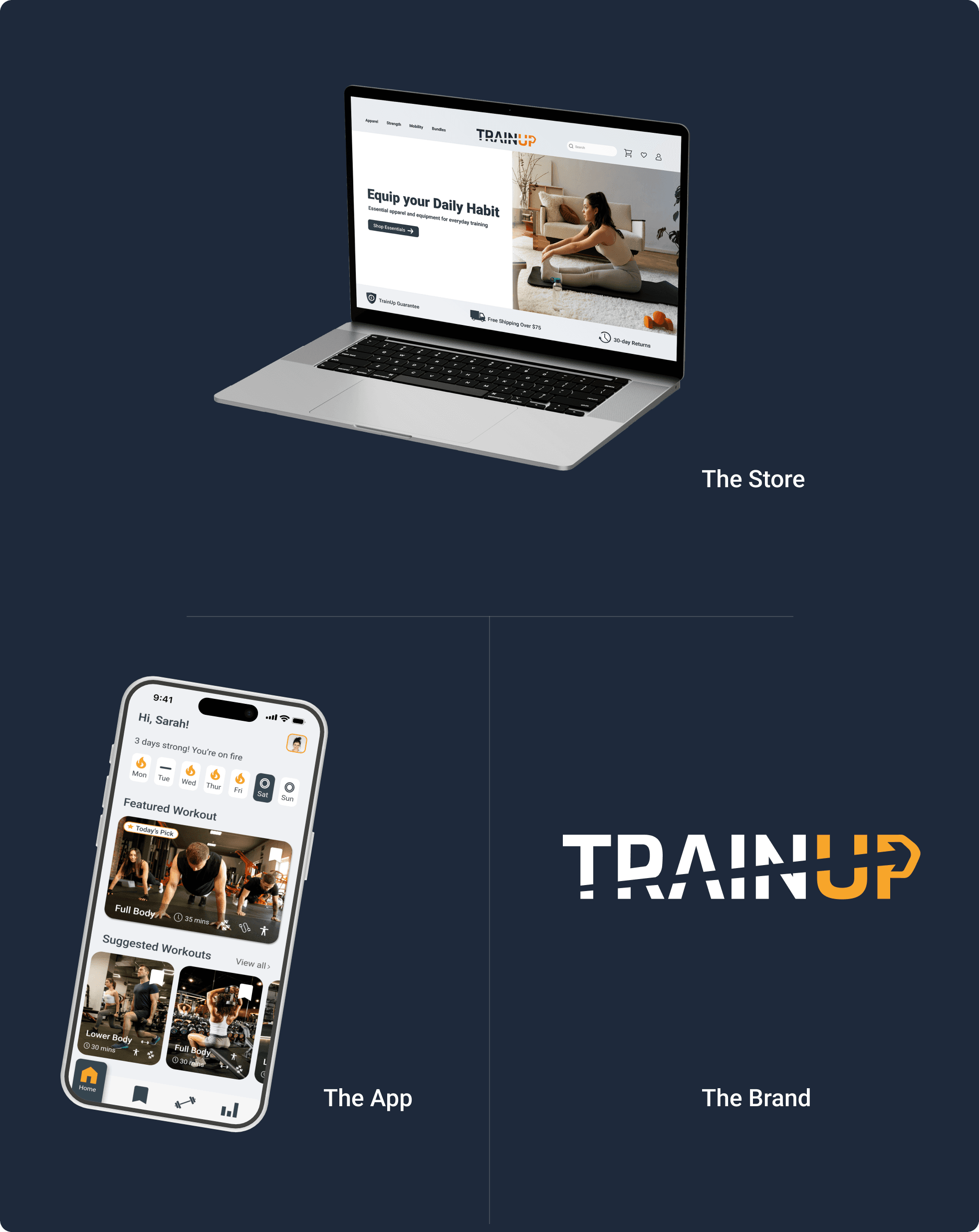
TrainUp — E-commerce
TrainUp — Fitness App
A fitness store designed to help people find exactly what they need — not to get lost in it.
A fitness store designed to help people find exactly what they need — not to get lost in it.
Case Study
UX/UI Design
Web Design
E-commerce
B2C
MY ROLE
UX/UI Designer
UX/UI Designer
TOOLS
Figma · PS · Affinity
Figma · PS · Affinity
TYPE
Concept Project
Concept Project
the brief
Built for the same person, not the average shopper
Built for the same person, not the average shopper
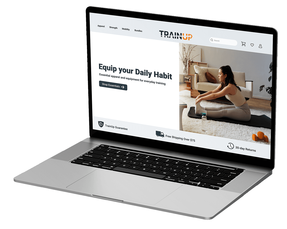
TrainUp's e-commerce store was designed with the same philosophy as the app — put the person first, remove every barrier between them and their goal. Not a store that sells at you. A store that helps you find what you actually need.
TrainUp's e-commerce store was designed with the same philosophy as the app — put the person first, remove every barrier between them and their goal. Not a store that sells at you. A store that helps you find what you actually need.
the problem
Most fitness stores are built to sell — not to help
Most fitness stores are built to sell — not to help
Endless product grids, aggressive upsells, pop-up newsletters, and ads designed to overwhelm — most fitness e-commerce experiences are built around conversion metrics, not the person shopping.
The result? Users land on a store, get bombarded with options, and leave without buying anything — or worse, buy the wrong thing entirely.
How might we design a fitness store where every person — regardless of age, experience, or goal — feels seen, not sold to?
How might we design a fitness store where every person — regardless of age, experience, or goal — feels seen, not sold to?
the research
What good and bad e-commerce looks like
What good and bad e-commerce looks like
The research for TrainUp's store focused on one question — what makes fitness e-commerce fail the everyday user?
Three patterns emerged consistently across every major fitness store analysed:
→ Products organised by type, not by goal Users need to already know what they want before they can find it
→ Decision fatigue at every step Too many options, too little guidance, no clear path from browsing to buying
→ Aggressive conversion tactics Pop-ups, countdown timers, forced newsletter sign-ups — designed to pressure, not to help
TrainUp's store was designed to do the opposite of all three.
TrainUp's store was designed to do the opposite of all three.
APP
PRIMARY FOCUS · GAP IDENTIFIED
Nike Training Club
Beautiful UI · Gym-Focused, Overwhelming
Strong Workout
Experience lifters · Not beginner friendly
7 Minute Workout
Quick workouts · Rigid, one size fits all
Fitbod
Adaptive workouts · Complex, expensive
Home Workout App
Home exercises · Doesn't adapt to user goals
MyFitnessPal
Calorie Tracking · Workouts are secondary
the users
Same people, different needs
Same people, different needs
The TrainUp store serves the same three people as the app. Alex needs equipment to level up his home training. Sarah needs something simple and fast — no endless browsing. Linda needs clear guidance — the right product for her goals, nothing intimidating, nothing overwhelming.
The store was designed so all three could shop confidently — without needing to know anything about fitness equipment before they arrived.
Alex, 30 — Full-time worker Fitness enthusiast
MOTIVATION
Build muscle and stay active
FRUSTRATION
Endless options, no clear starting point
CONSTRAINT
Under 30 mins · basic equipment · no gym
Sarah, 35 — Part-time retail worker, mother of two
MOTIVATION
Energy and strength to be present for her family
FRUSTRATION
Fitness plans feel complicated and hard to maintain
CONSTRAINT
Unpredictable schedule · early morning or late night only
Linda, 67 — Retired teacher, grandmother
MOTIVATION
Stay mobile and independent for her grandchildren
FRUSTRATION
Gym feels intimidating · fears injury from wrong exercises
CONSTRAINT
No gym · basic equipment · needs low-impact guidance
Everyone deserves to find exactly what they need — regardless of how much they know about fitness equipment.
Everyone deserves to find exactly what they need — regardless of how much they know about fitness equipment.
the PROCESS
Designing around the goal, not the product
Designing around the goal, not the product
Every decision in the TrainUp store started with the same question as the app — does this actually help the person, or does it make them think more?
Organizing by goal, curating bundles, the slide-out cart, the sticky Add to Cart that keeps the purchase one tap away, the frictionless checkout — every piece of it answers that question the same way.
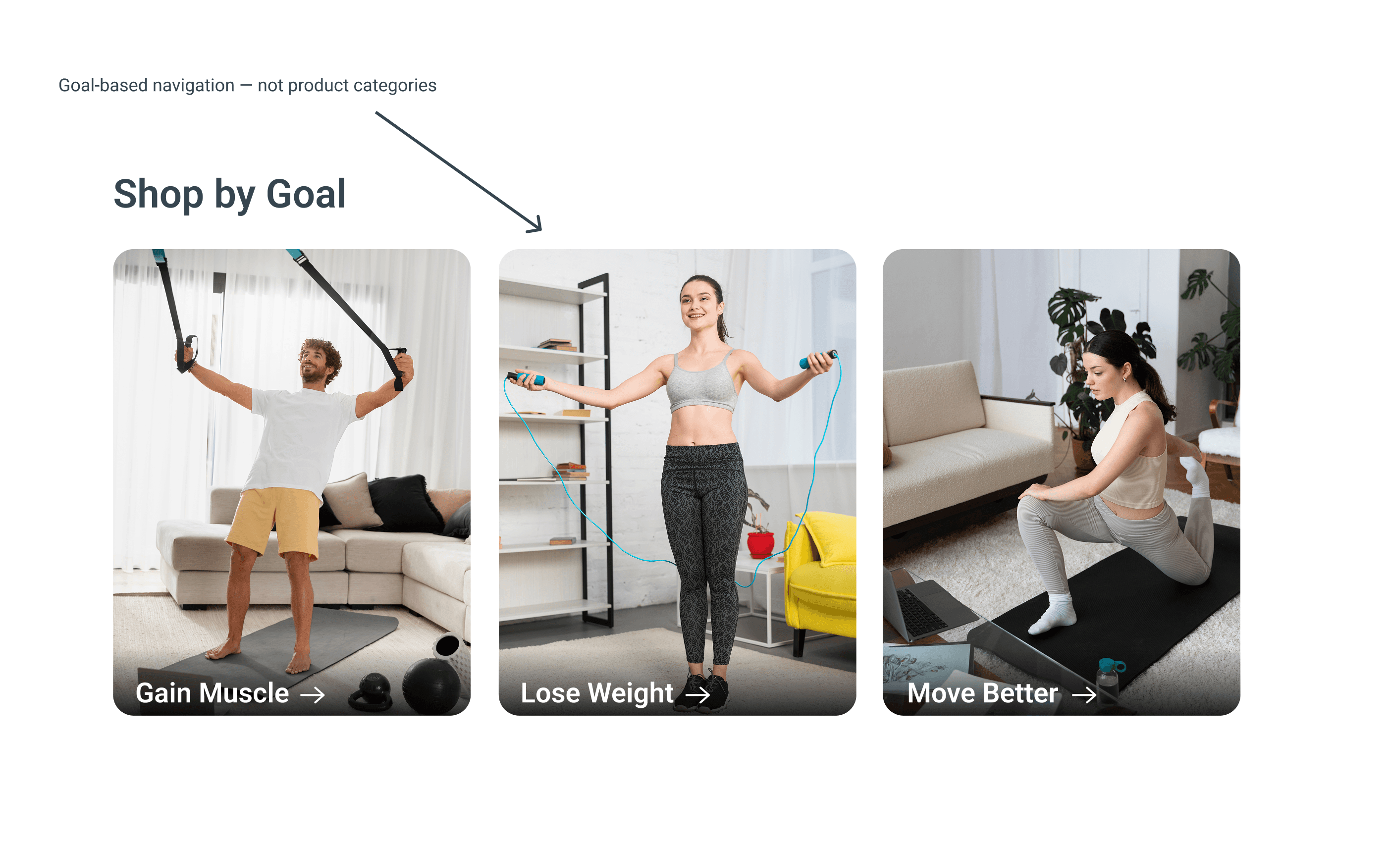
Shop by Goal — The Core Decision
Shop by Goal — The Core Decision
Traditional fitness stores organize by product type — Dumbbells, Resistance Bands, Yoga Mats. That works if you already know what you need. It fails completely for Linda, who just wants to stay mobile. It fails for Sarah, who wants more energy. It fails for Alex, who wants to build muscle at home.
Shop by Goal changes everything. Three clear entry points — Gain Muscle, Lose Weight, Move Better. The user starts with their goal, not a product category.
Custom workout builders, advanced filtering, calorie tracking, meal planners, and social features. Each idea was evaluated against one question: Does this help the user work out, or does it make them think more?
The custom workout builder was cut. Giving users the ability to manually add and remove exercises introduced the same decision fatigue TrainUp was designed to eliminate. Calorie tracking was removed — not relevant to all users and directly contradicts the frictionless philosophy. Social features were cut — competition is the opposite of what Linda and Sarah need.
Every removed feature made TrainUp stronger. Subtraction was the design process.
The user starts with their goal. The store does the rest.
The user starts with their goal. The store does the rest.
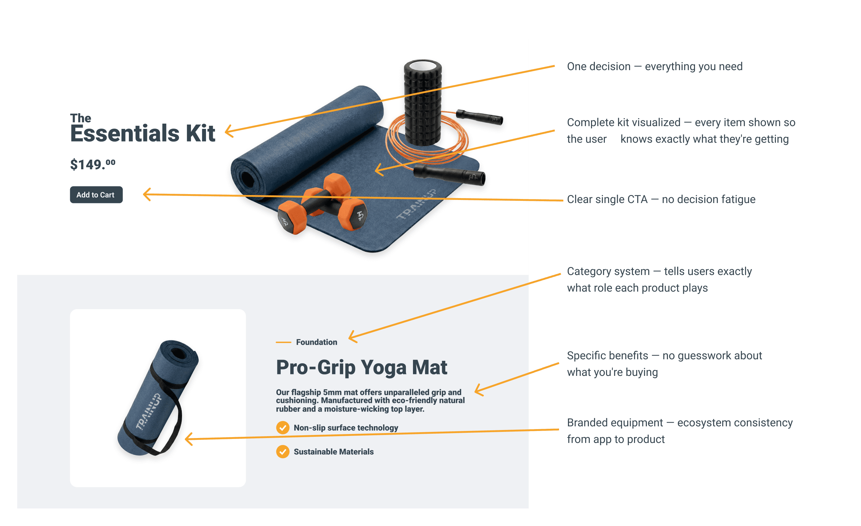
The Essentials Kit — Removing Decision Fatigue
The Essentials Kit — Removing Decision Fatigue
Even within a goal category, choosing individual products creates the same overwhelm the store was built to eliminate. The Essentials Kit solves this.
One bundle. Everything you need. Each item labeled with its purpose — Foundation, Strength, Cardio, Recovery. No guesswork. No research required.
Custom workout builders, advanced filtering, calorie tracking, meal planners, and social features. Each idea was evaluated against one question: Does this help the user work out, or does it make them think more?
The custom workout builder was cut. Giving users the ability to manually add and remove exercises introduced the same decision fatigue TrainUp was designed to eliminate. Calorie tracking was removed — not relevant to all users and directly contradicts the frictionless philosophy. Social features were cut — competition is the opposite of what Linda and Sarah need.
Every removed feature made TrainUp stronger. Subtraction was the design process.
The user starts with their goal. The store does the rest.
The user starts with their goal. The store does the rest.
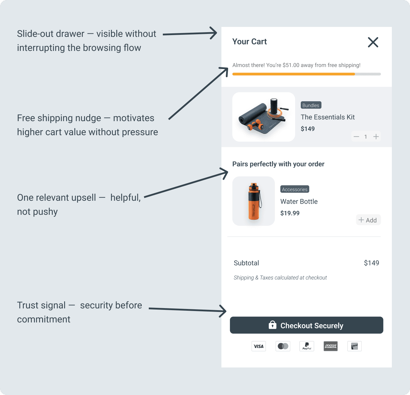
The Cart Drawer — Staying in Flow
The Cart Drawer — Staying in Flow
The cart opens as a slide-out drawer — not a modal, not a full page, not a tiny popup. A deliberate middle ground.
A modal blocks everything — too aggressive. A popup is too small to be useful. A full page breaks the browsing flow entirely. The drawer gives users full cart visibility without pulling them away from where they were.
The cart should feel helpful, not pushy.
Every element here earns its place.
The Checkout — Friction Removed
The Checkout — Friction Removed
The biggest drop-off point in any e-commerce experience is the checkout. Every extra step, every surprise cost, every moment of confusion loses a customer.
Express checkout options remove the barrier for returning users completely. The order summary stays visible throughout — no surprises at the end.
Custom workout builders, advanced filtering, calorie tracking, meal planners, and social features. Each idea was evaluated against one question: Does this help the user work out, or does it make them think more?
The custom workout builder was cut. Giving users the ability to manually add and remove exercises introduced the same decision fatigue TrainUp was designed to eliminate. Calorie tracking was removed — not relevant to all users and directly contradicts the frictionless philosophy. Social features were cut — competition is the opposite of what Linda and Sarah need.
Every removed feature made TrainUp stronger. Subtraction was the design process.
The best checkout experience is the one the user barely notices.
The best checkout experience is the one the user barely notices.

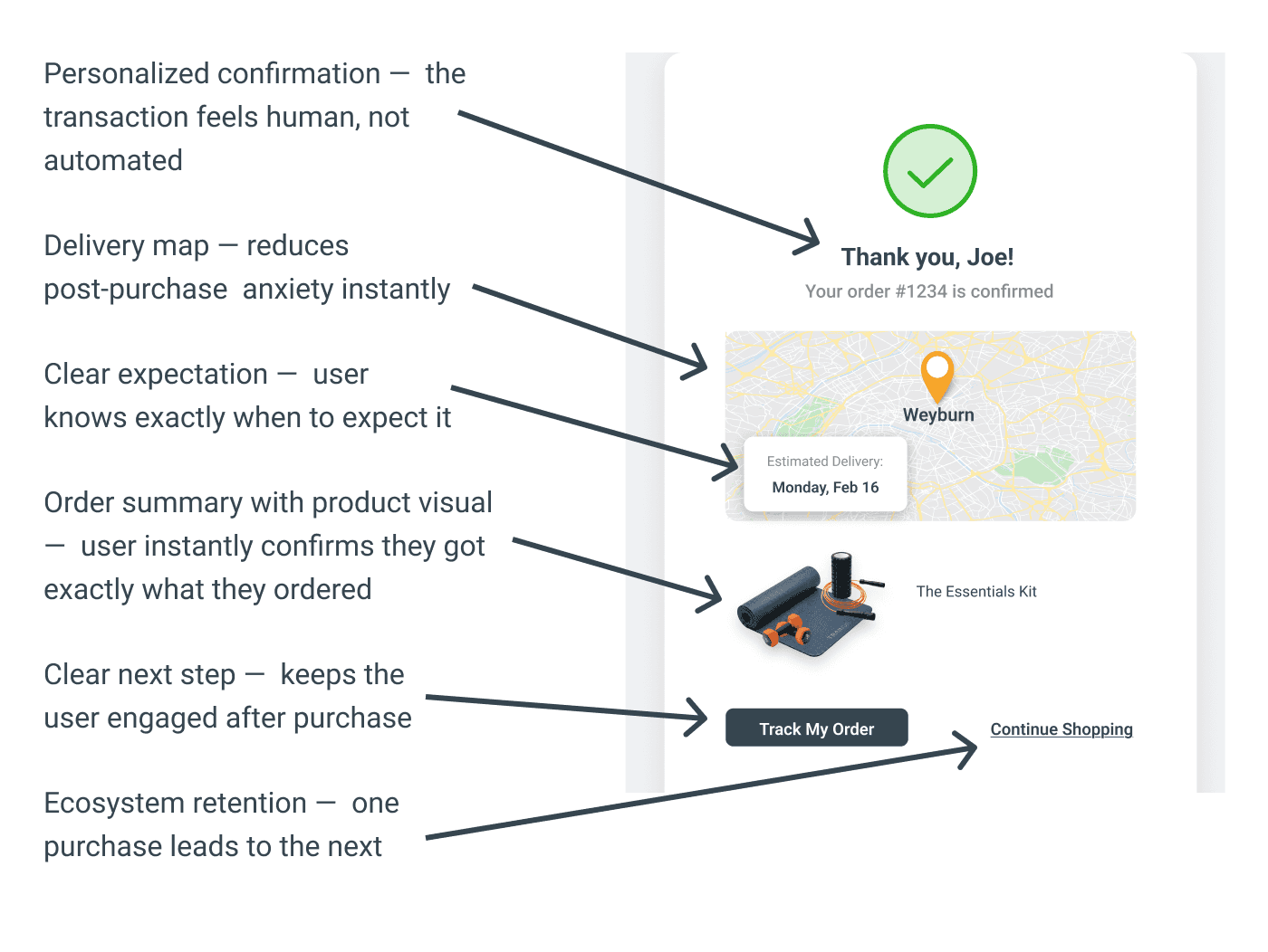
Ecosystem retention — one purchase leads to the next
Ecosystem retention — one purchase leads to the next
Most stores stop caring the moment the order is placed. TrainUp doesn't.
Personalized with the customer's name. A map showing the delivery location. Estimated delivery date. Two clear next steps — track the order or keep shopping.
The ecosystem connection closes here too — a user who just bought equipment is the perfect person to download the TrainUp app.
The transaction ends. The relationship with TrainUp doesn't.
The Ecosystem Connection — Two Entry Points
The Ecosystem Connection — Two Entry Points
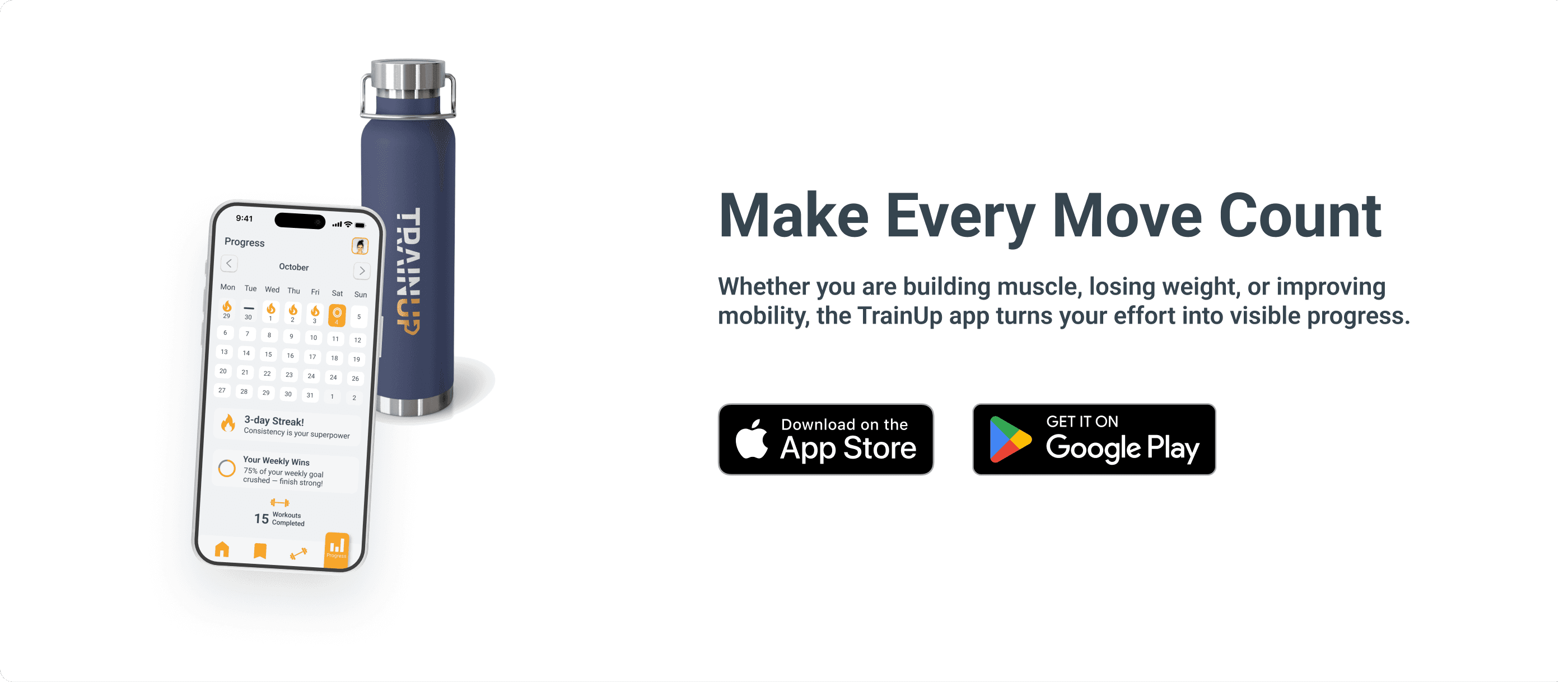
Most fitness stores sell products. TrainUp's store does something different — it actively guides users into the app. A user discovers the store first, buys equipment, and downloads the app to start training with it.
A user discovers the app first, needs equipment, and finds the store naturally. Neither product loses a user.
The app download section sits prominently in the store — not hidden in the footer, not an afterthought. A deliberate design decision that turns a customer into a long-term TrainUp user.
Custom workout builders, advanced filtering, calorie tracking, meal planners, and social features. Each idea was evaluated against one question: Does this help the user work out, or does it make them think more?
The custom workout builder was cut. Giving users the ability to manually add and remove exercises introduced the same decision fatigue TrainUp was designed to eliminate. Calorie tracking was removed — not relevant to all users and directly contradicts the frictionless philosophy. Social features were cut — competition is the opposite of what Linda and Sarah need.
Every removed feature made TrainUp stronger. Subtraction was the design process.
One ecosystem. Two entry points. Neither product loses a user.
One ecosystem. Two entry points. Neither product loses a user.
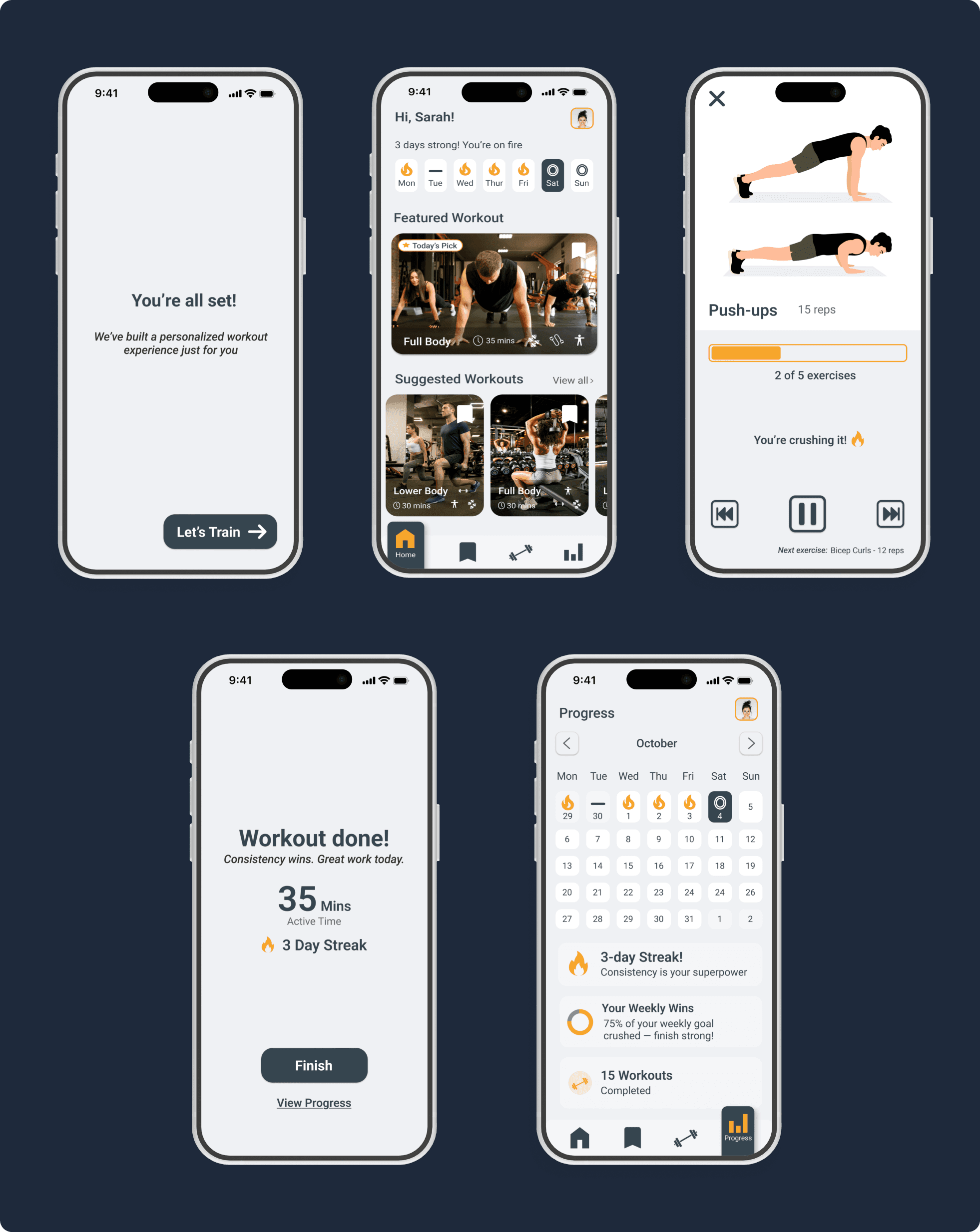
the solution
The finished store
The finished store
Every decision — organizing by goal, curating bundles, the slide-out cart, the frictionless checkout — led here. A fitness store that helps people find exactly what they need, without getting lost in the process.
Five screens. One direction. No dead ends.

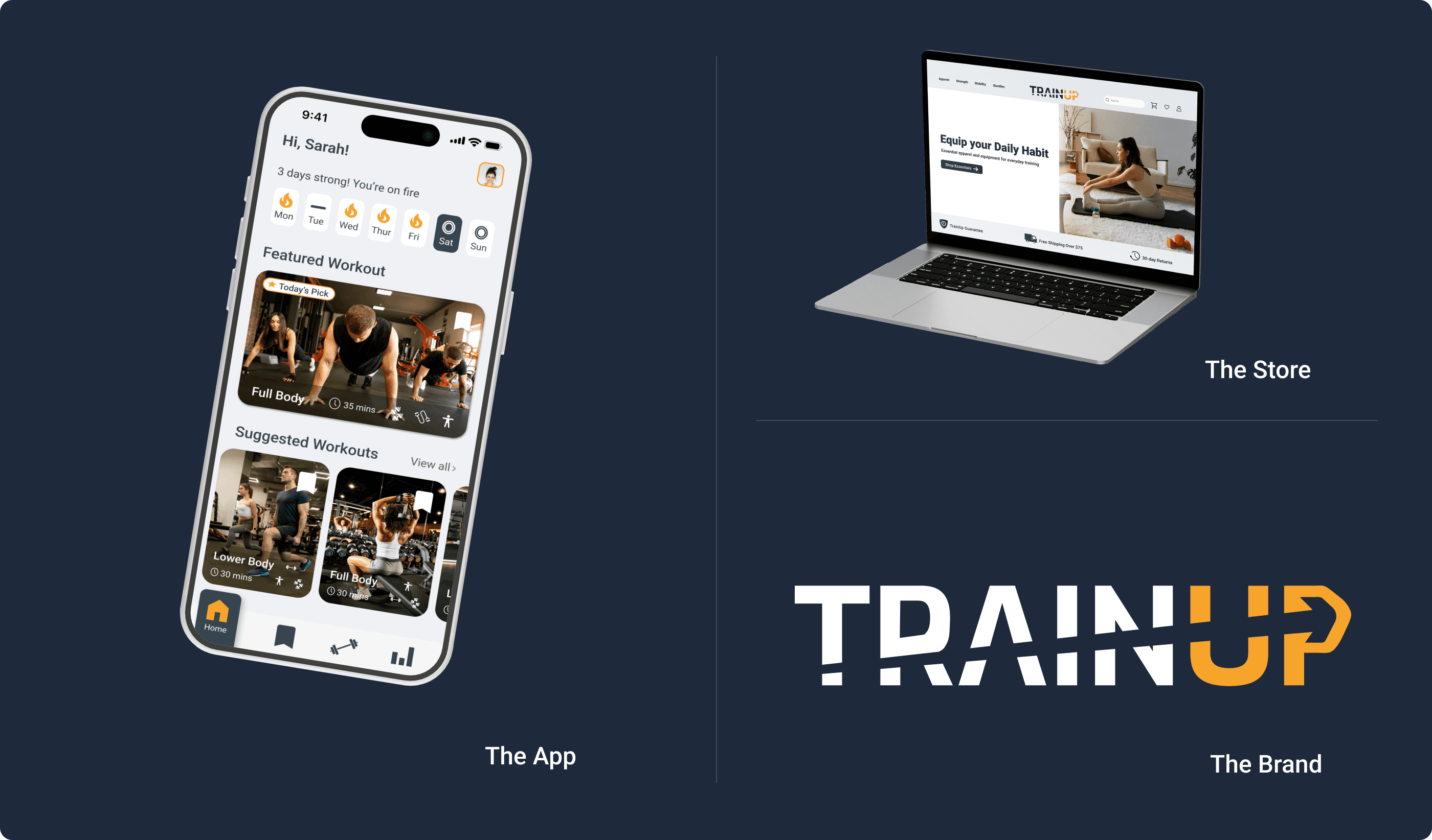
the ecosystem
One brand. Three products. One experience.
One brand. Three products. One experience.
The store doesn't exist on its own. It's one part of a connected system — the app tracks your goals, the store supplies your equipment, and the brand ties it together. Every product a user buys brings them closer to the full TrainUp experience.
The store doesn't exist on its own. It's one part of a connected system — the app tracks your goals, the store supplies your equipment, and the brand ties it together. Every product a user buys brings them closer to the full TrainUp experience.
The Connection
The Brand Identity is the visual foundation — every color, every typeface, every design decision in both the app and the store flows from it. It's not three separate projects that happen to share a name. It's one product ecosystem with three entry points.
The Brand Identity is the visual foundation — every color, every typeface, every design decision in both the app and the store flows from it. It's not three separate projects that happen to share a name. It's one product ecosystem with three entry points.
How They Work Together
A user downloads TrainUp and starts working out at home. Over time they want better equipment — the store is the natural next step, organized around the same goals the app already knows about them.
A user discovers TrainUp through the store. The app is the natural next step. One product leads to the other. The ecosystem retains users that either product alone would lose.
The Visual System
Every touchpoint — app, store, brand identity — shares the same color system, typography, and design language. A user moving between the app and the store never feels like they've left. That's not a coincidence. That's a design system doing its job.
Every touchpoint — app, store, brand identity — shares the same color system, typography, and design language. A user moving between the app and the store never feels like they've left. That's not a coincidence. That's a design system doing its job.
This is what product thinking looks like at a systems level.
the REFLECTION
What TrainUp taught me
What TrainUp taught me
What I'm Most Proud Of
What I'm Most Proud Of
The restraint.
TrainUp could have been overwhelming. The feature list started long — custom workout builders, social features, calorie tracking, meal planners. Every single one was cut, not because it wasn't interesting, but because it didn't serve the person using the app.
The question I kept asking wasn't "would this be cool?" It was "would I actually use this? Would Sarah? Would Linda?" Features that couldn't answer yes were removed.
Every element earns its place. Nothing exists for decoration. Everything exists because a real person needed it.
What I'd Do Differently
What I'd Do Differently
The onboarding flow was the decision I was least certain about.
Seven questions felt like the right number — enough to personalize the experience without overwhelming the user before they've even started. But that decision was based on instinct, not validated data.
Would a first-time user abandon the app at question four? Would Linda feel intimidated? Would Alex skip the whole thing to get to the workouts faster?
Without real users moving through that flow, every onboarding decision was an educated assumption. If I could go back, I would have tested the onboarding with five real people before building anything else.
What's Next
If TrainUp were a real funded product, the first move would be simple — get it into real hands as fast as possible.
A free MVP with ads. Not because the design is unfinished, but because no amount of solo design thinking replaces hundreds of users with completely different goals, fitness levels, and lives.
Real feedback drives real iterations. That's how a good product becomes a great one.
TrainUp started as a personal problem. It became a product designed for everyone the fitness industry keeps forgetting. That's still the mission.
PREVIOUS PROJECT
TRAINUP APP
NEXT PROJECT
TRAINUP BRAND IDENTITY